10 Best Fonts for Your Product Labels
Brand owners seeking to market their products online or in traditional retail stores share a similar goal: direct consumers’ attention to their brands. One proven way to pique buyer’s interest is through captivating product label design.
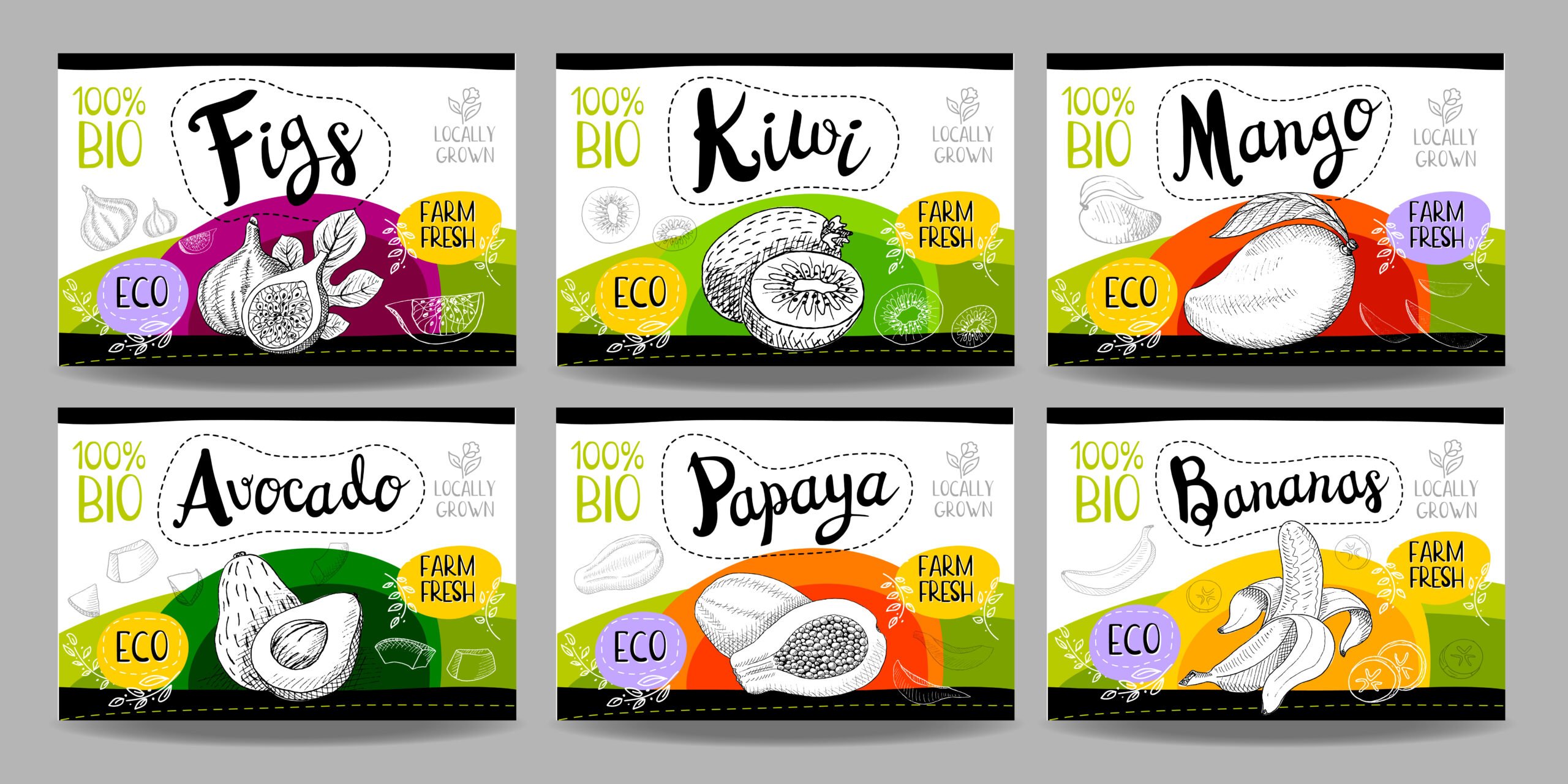
Product labeling helps consumers identify your brand and influence their buying decisions. Its layout, colors, and fonts serve as the display sales pitch to potential customers. Often, one of the more challenging tasks of designing product labels is choosing the right font or typography.
It may seem simple, but a font’s size, readability, and style have the power to evoke your brand’s feel. This article will give you a rundown of the different font types. You can choose the best fonts for your brand.
Serif
These are fonts with decorative “feet” at the end of every letterform, exuding a sleek and classic look.

This font works well if a brand wants to evoke a luxurious and elegant presence that fits their brand identity, such as wine and clothing brands.
Butler is another serif typeface that emanates a modern look with its refined take on curving classical serif styles. When you see it on display in a retail store, it has that look that can capture customers’ attention because of its fancy curves.
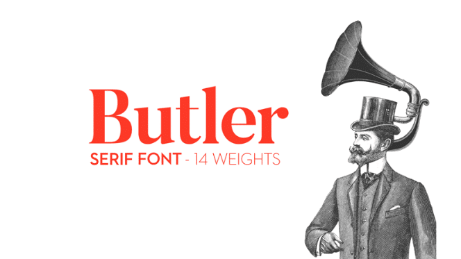
This font works best for brands of food products like peanut butter and cookies. If the brand wants something fancy with a touch of modernism, this is also a great choice.
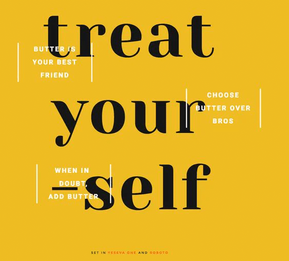
This font works well in feminine care products and cosmetics packaging or when a brand aims to communicate its message in a conservative and approachable way.
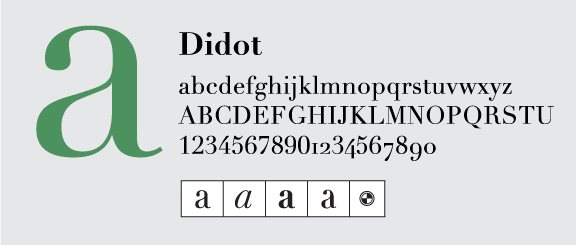
The font used in the Giorgio Armani logo is one of the many versions of Didot. The extreme contrast and thickness of the font give it a dramatic and classy look. The font is often seen in fashion—magazines, and labels, among others.
This font works well if a business wants to give the brand a dramatic and luxurious look that remains mature. It’s excellent for jewelry brands, cosmetics, fragrances, and eyewear.
Sans Serif
Sans Serif fonts don’t have “feet” at the ends of letterforms. These are easier on the eyes and considered more modern than Serif fonts.

The Aileron font family is an interpretation of the Neo-Grotesque typeface, including Helvetica. Aileron is distinguished with its curved lower case letter “l.” The dot on the letters “i” and “j” are rounded, giving a soft impression to the font.
This font works well for businesses that intend to give their brand a futuristic appearance. It’s also ideal for clothing brands and startup businesses looking for a font to match their “new-brand-on-the-block” identity.
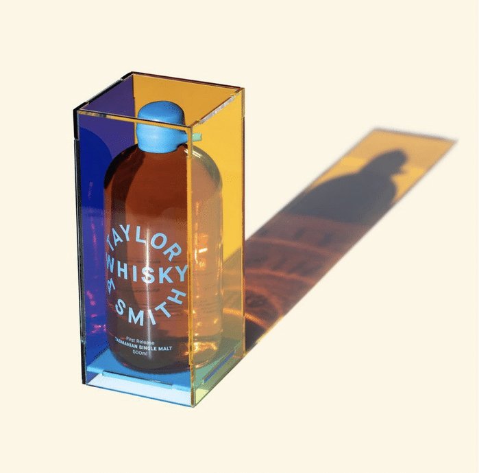
Maison Neue is adapted from an earlier typeface called Maison. Maison Neue is created with the primary goal of making it more usable, resulting in a functional typeface that exudes a contemporary feel but still pleasing to the eye. It’s exquisite yet versatile.
This font works best for brands that want to cover their products with a classy font without “feet.” Depending on the font combination, it can be sophisticated enough for whiskey packaging and playful enough for a skincare or makeup line.
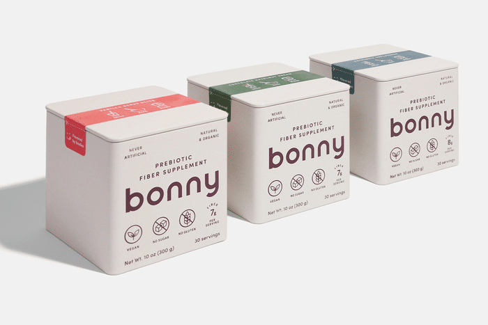
Sofia is a geometric sans serif that intends to give off a warm and welcoming feel. The font looks stylish in a minimalist way and reads legibly. It may look ordinary at first, but its rounded and easy-to-read design makes it stand out.
This font works best if the brand prefers a humanistic feel to its products. If the intention is to get the message across without frills, this font can deliver. This can look good for coffee bean packages, baby care products, and hand sanitizers or linen sprays.
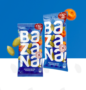
Omnes is another rounded and gorgeous sans serif typeface that pairs well on creative materials or heavily designed packaging with attractive and playful colors. It boasts curved edges, but is crisp in style.
This font works well for brands that desire to highlight the product name as a wordmark, making it a fantastic fit for snacks, beverages, and other food products. It’s an attention-grabbing font for customers.
Script
This type of font can be both formal and casual. Script fonts have loops and evoke a more personal feeling reminiscent of handwriting.
Lucia Script is very easy to read despite its loops and fashionable calligraphic elements. It exudes elegance with a touch of romance. It looks high-end, making it ideal for luxury brands. Brands can match this font with a serif font to create a fancy product label.
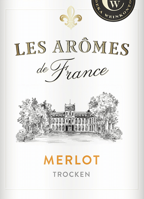
This font works well for brands that offer luxury in their products and customer experience. Ideally, Lucia Script works well for wine products and other high-end goods.
For a script font with a little more “oomph,” Satisfy can deliver. It’s a brush script that has modern elegance yet can be a timeless classic. It can be front-and-center on a product label or used as the font for its tagline.
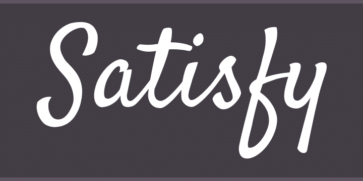
This font works best for food products, particularly pastries, snacks, and beverages, to define the specific product. With the right font combination, it can create a delicate label that is gracefully crafted.
Make Your Brand Memorable
There are so many typefaces out there to choose from that it can get overwhelming. It’s essential to determine one’s brand identity first to see what type of fonts would attract its target audience. With the right font pairings and layout, typography can give your products a personality.
If you want to bring your labels to life, then you’re in the right place. Talk to an expert at Meyers for product label printing solutions and anything related to professional printing. Get in touch with us now!

